Al Gore: Master Debater

Posted on

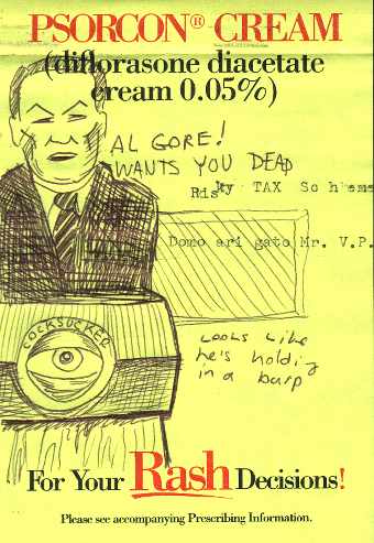
Well, I just finished watching the first debate of the 2000 election. Here is a doodle I made of Al Gore during the broadcast. All the pundits talk about how great a debater Al is, but I just can’t get past his overplayed emotions and his I’m-talking-to-a-6-year-old delivery. Hey, and has anybody seen his eyebrows!?! My ol’ uncle Mervis P. Napkin once told me, “Never trust a man who ain’t got no eyebrows… they gets all that sweat in their eyes and that ain’t right.” There’s definitely something above his eyes, a weird lump of skin or something. Perhaps some silly putty clumps?

They do a lot of Democrat/Al Gore design pieces in the design studio where I work. They make a point out of covering up or cropping his wispy bald spot in the photos they use. I wish they would just airbrush in some Dekaukus/apeman eyebrows. It just ain’t right. Or as Mr. Gore like to say in his best, condescending tone, “That would be unconscionable, and that means… BAAADD!!

My Studio Space (2000-2007)

Posted on

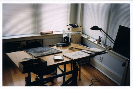
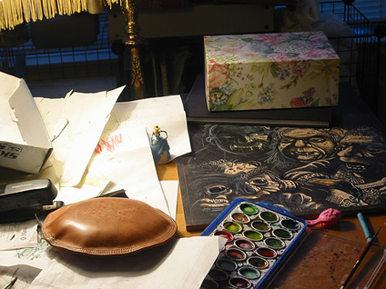
Here are some pictures of my workspace from about 2000-2007, which was just a corner in my apartment. I work primarily as a woodcut printmaker. Of all the printmaking processes, woodcuts (relief prints in wood) are perhaps the least toxic. This means I can get away with doing my work in the confined space of an apartment. The process also requires very little in terms of equipment. A knife, wood, paper, an ink roller and ink are the only supplies one needs.

Art Studio 1

This is about the extent of my studio space. Because I can’t get too sloppy, I don’t really have a place to print my blocks, I usually move to my kitchen for that. What’s missing from this view is the TV and Stereo which are usually on while I work.

Art Studio 2

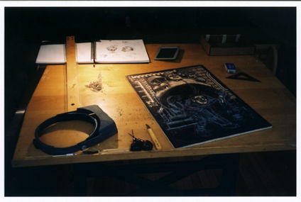
Despite the photographic chairoscuro of this scan, desk is usally very well lit. Like many woodcutters/engravers, I have have a whole bunch of tools for cutting, yet, I seem to revert to the same couple of tools (seen on the lower middle) all the time.

Art Studio 3

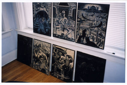
Here is my current series of woodcuts in progress. The two on the bottom which are completely black are the ones that I have already printed.

Art Studio 4

These days Nova’s drawing and painting supplies have taken over my space. You can see a hint of the print I am currently working on (when I have the time and energy to do art).

A Homebrew Atari 2600 Cartridge Design

Posted on
Elevators Amiss Maid

Recently, I took the time to enter an art contest. It was sponsored by AtariAge.com—a Web site devoted to the the preservation of the Atari 2600 and other ancient Atari computers and consoles. They also are one of the few places that sell new(!) games for the Atari 2600.

It was one of these new, so-called homebrew games that was the object of the contest. The game is called Elevators Amiss and it involves running a tiny pixelized chambermaid up the floors of a hotel, trying to avoid the elevators that move up and down across your path. Think of it as a less complicated version of Frogger. The winner of the contest was to receive a copy of the game and a credit from the AtariAge store. That was enough to get me to give it a go (I’ve been eying the Joystick to USB converter for awhile now).

My approach to the design was to create an image that was dynamic and made you think you were buying a 3-D video action extravaganza… pretty much like every Atari game box tricked me into thinking when I was a kid. Looking back on past winners, I noticed that there were many entries that used some of the same design and layout of the classic games that Atari put out in the early eighties. In my opinion, such designs go against the spirit of homebrew Atari games. These games are not really about nostalgia, they more are about taking a near-dead platform and breathing new life into the system.

The hardest part about illustrating this game it that the theme of killer elevators doesn’t work well outside of the constraints of the 2-D pixelated screen. My idea was to have the elevators flying through the walls and ceilings, completely dislodged from their elevator shafts smashing everything in their paths. In the image, the chambermaid is sprinting down the hall, just avoiding a crashing elevator car. Originally, I was going to give her a rainbow colored tracing of her movements trailing behind her (ala the Keystone Kapers box) but I liked my elevator painting too much to cover it up with action lines. Anyhow, here’s the final product for your viewing pleasure.

Unfortunately, I did not win the contest. The winner was Nathan Strumm #1. It was one of the better ideas, but to me it doesn’t capture the essence of the actual game play. My personal favorite was Patricio Cuello #1—simple idea, well executed with lots of colors. It seemed very appropriate to me. Check out the contest page to see all the entries.

The Scholl Family Art Show

Posted on

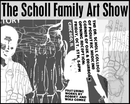
My wife, Wika, and I had artwork on display in this exhibition back in October of 2001. The show was made up of various students, faculty, and their spouses from Dr. Scholl College of Podiatric Medicine in Chicago, which use to be located at the corner of Oak and Dearborn in Chicago’s Gold Coast neighborhood.

The Scholl Family Art Show

Above is the show announcement that I made to hand out to friends.