Elevators Amiss Atari Cartidge Label Concept
Recently, I took the time to enter an art contest. It was sponsored by AtariAge.com—a Web site devoted to the the preservation of the Atari 2600 and other ancient Atari computers and consoles. They also are one of the few places that sell new(!) games for the Atari 2600.
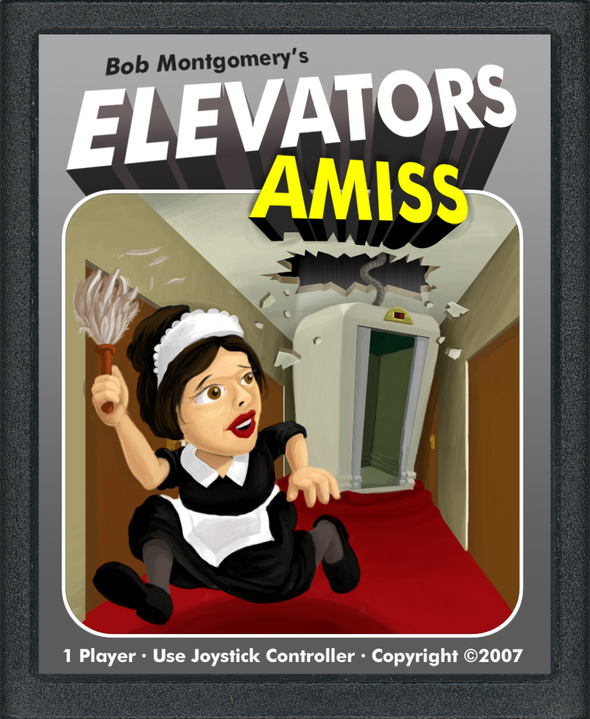
It was one of these new, so-called homebrew games that was the object of the contest. The game is called Elevators Amiss and it involves running a tiny pixelized chambermaid up the floors of a hotel, trying to avoid the elevators that move up and down across your path. Think of it as a less complicated version of Frogger. The winner of the contest was to receive a copy of the game and a credit from the AtariAge store. That was enough to get me to give it a go (I’ve been eying the Joystick to USB converter for awhile now).
My approach to the design was to create an image that was dynamic and made you think you were buying a 3-D video action extravaganza… pretty much like every Atari game box tricked me into thinking when I was a kid. Looking back on past winners, I noticed that there were many entries that used some of the same design and layout of the classic games that Atari put out in the early eighties. In my opinion, such designs go against the spirit of homebrew Atari games. These games are not really about nostalgia, they more are about taking a near-dead platform and breathing new life into the system.
The hardest part about illustrating this game it that the theme of killer elevators doesn’t work well outside of the constraints of the 2-D pixelated screen. My idea was to have the elevators flying through the walls and ceilings, completely dislodged from their elevator shafts smashing everything in their paths. In the image, the chambermaid is sprinting down the hall, just avoiding a crashing elevator car. Originally, I was going to give her a rainbow colored tracing of her movements trailing behind her (ala the Keystone Kapers box) but I liked my elevator painting too much to cover it up with action lines.
Unfortunately, I did not win the contest. The winner was Nathan Strumm #1. It was one of the better ideas, but to me it doesn’t capture the essence of the actual game play. My personal favorite was Patricio Cuello #1—simple idea, well executed with lots of colors. It seemed very appropriate to me. Check out the contest page to see all the entries.