Gods’ Man: A Novel in Woodcuts

Beautiful wood engravings are the reason to “read” this.
Beautiful wood engravings are the reason to “read” this.
I loved I, Claudius but was utterly bored by this. Maybe I would have appreciated more if I had more than a passing knowledge of the Bible. It doesn’t help clear up matters when it seems like half the characters are named either Mary or John.

A lot of people hated this movie, but I thought it was pretty darn good. Okay, the demons were a bit much and there’s not much character development, but the slow beginning pays off with an exciting, stylish finale.
Well, someone finally found a film genre that hadn’t been parodied—the rock bio pic. They pull it off relatively well. The film suffers from the foible of most modern comedies, which is to find a funny joke and then point it out to the audience again and again like a stale SNL routine. Yeah, yeah, he cut his brother in half. That stopped being funny about 5 minutes into the film.
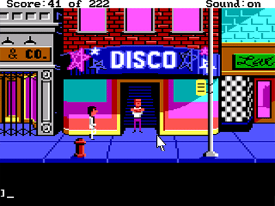
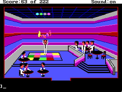
Leisure Suit Larry is one of my favorite adventure games of all time. Certainly the best of the Sierra 3-D games in my opinion. It may not the most challenging game or have the deepest storyline, but what it lacks in depth, it makes up for in humor. Leisure Suit Larry is essentially an 80s PG-13 sex comedy in pixelated form.
The graphics, crude as they may be, are completely appropriate for the mood of the game. By keeping the imagery minimal, Larry’s dirtiness attains a level of cuteness that never comes across as anything but good-natured fun. My favorite moment is the disco dance scene which borrows heavily from the movie, Airplane!
This is one of the few Sierra games that I actually completed as a youngster, back before the days of the Internet. When I inevitably got stuck, I needed to use a hint book. I remember the hint book also included the setup to the dirty jokes’ punchlines that the barfly at Lefty’s keeps muttering (always followed by a “Har, har, har…”). Now that I do have access to walkthroughs and such, I may try to tackle the sequels. I got about halfway through Larry 2 before giving up.
Oh, and one last thing. The Lesuire Suit Larry theme song—what a great, catchy tune. You’ll be whistling it for days. I believe it was written by Al Lowe himself. I was very disappointed when, as a teenager, I saw Al Lowe on Name That Tune and there was no mention of his dirty-old-man video game designer career, just his musical background. Yawza, yawza, indeed.
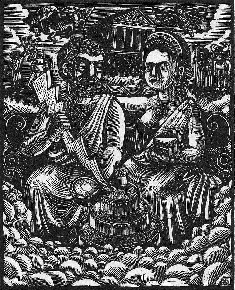
This is a wood engraving that I created for my brother’s wedding invitation in 2002. He got married in Athens, Greece so I wanted to do a Greek god themed image.Here we have Hera and Zeus, with Zeus cutting the cake with his lightning bolt. The actual invitation had a translucent sheet in front of the print with some metallic lettering and an olive leaf motif.
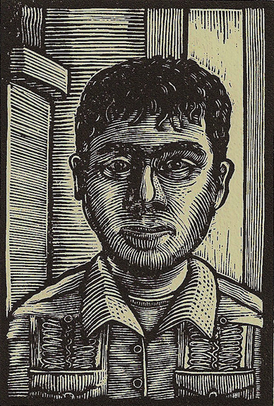
A tiny wood engraving I did. Technically it’s not a wood engraving since I engraved into a plastic engraving medium called “Resingrave.” I have plenty of copies available for purchase.
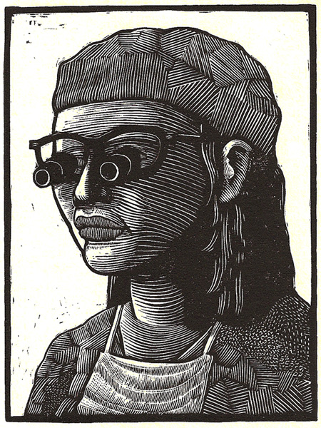
This is another “Resingrave” wood engraving. This one is a portrait of my wife, Wika, wearing surgical magnifying glasses.
An edition of 24, I have plenty of copies available for purchase. The price is a mere fifteen bucks! Postage paid! If you are interested in purchasing one, click the link to the left.
Well, I just updated the core version of the Drupal CMS on the Pages of Fun from 6.12 to 6.13 and it went pretty smoothly. One thing that I did discover is that it pays to update all your modules before doing the core update. I had earlier tried to update and the system completely failed on install because of a problem with the out-of-date Admin Menu module. Only a complete reversion to the backed up files saved me. Backing up is ever so very important in this whole process. Anyhow, I am really loving Drupal and I hope to build more sites with it in the future.
Bruce Campbell’s self-depricating monster movie. Somewhat of a big in-joke, but I found myself laughing a few times.