Pages of Fun: Version 3.3 Dec 1999-Sept 2000
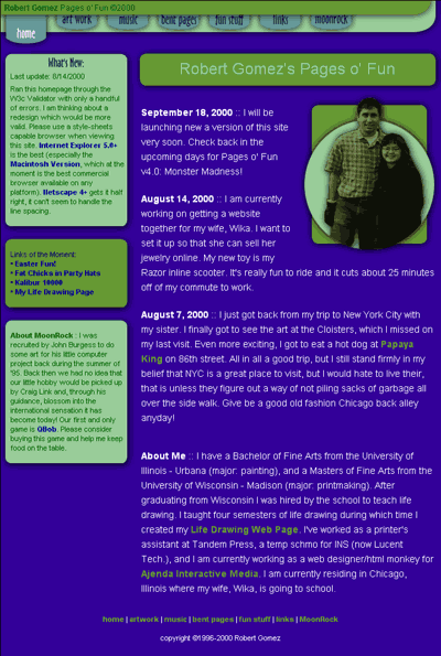
One of the first things I did when I bought by new computer was update my personal site. I was and am still pleased with this result. It was my first serious use of style sheets, and for awhile had some cool animated buttons at the top. The animations were kind of flaky so I got rid of them early on. I liked the organization and relatively clean text layout.
The big problem with this version was that it rendered rather poorly in Netscape 4 despite the fact that it used a different style sheet for Netscape. A problem I still deal with in the current site, but to a far lesser degree (Please leave Netscape 4 to die, it is a really terrible browser…6 looks promising though). It was also way too table heavy for my more simplified HTML structured tastes, making it tedious to update and change.